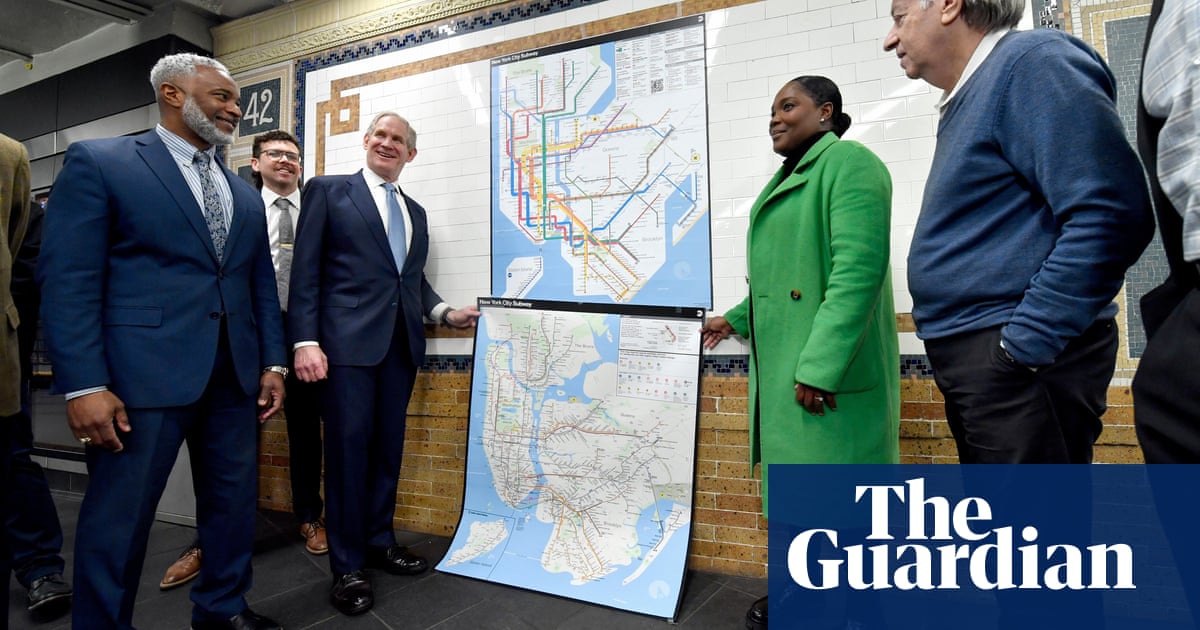
The New York City subway map can be a bit confusing. Unlike maps in cities like Boston or London, the NYC map resembles the landscape above ground. You can see landmarks like Central Park and the outlines of each borough. But the subway lines, which twist and turn, can be intimidating, especially when you’re trying to figure out local versus express trains.
Recently, the Metropolitan Transit Authority (MTA) introduced a new subway map—its first major update in nearly 50 years. This version simplifies the design while still showing boroughs and parks. Subway lines stand out clearly, making it easier for riders to understand which train to take.
This change is a big deal. The previous map has been around since 1979 and was often criticized for its complicated layout. The new design aims to be more user-friendly. It’s meant to offer essential travel information in a clear and vibrant way.
The design process involved a lot of thought. The new map balances the familiar grid layout of Manhattan with the need for clarity. As mapmaker Jake Berman points out, New Yorkers know their city well. This makes it tough when a map doesn’t reflect real-life geography. Unlike cities with more complex street layouts, New Yorkers expect streets and avenues to align accurately.
The new map brings back echoes of Massimo Vignelli’s 1972 diagram, which prioritized minimalism but was unpopular. Vignelli’s version, though, was similar to other cities’ maps where geography took a backseat to clarity. For example, London’s Tube map, praised for its simplicity, can mislead tourists who think they need to ride the subway instead of walking a few blocks.
Reactions to the new map have been mixed. Some passengers find it modern and visually appealing. Others feel uncertain, suggesting that it may take time for New Yorkers to adapt. Historically, New Yorkers have not embraced change easily. Shifts in subway maps or even food options can lead to public outcry.
Curator Jodi Shapiro notes that the subway map is always evolving, a “living document” that reflects changing needs. The latest redesign was a decade in the making, combining ideas from both past maps.
Social media has played a role in shaping opinions about the new design. Some enthusiastic responses emerged from Reddit users, praising the vibrant colors and layout. Others have noted the importance of navigation tools like Google Maps, which allow for real-time adjustments once passengers reach street level.
Ultimately, the success of the new subway map will depend on its effectiveness in helping riders get to their destinations smoothly. As Berman notes, New Yorkers may complain, but if the map guides them well, it’s likely to earn its place in the city’s transport system.
In sum, while the new subway map represents a significant change, it may also be a vital step toward making New York’s transit system more accessible to everyone. Only time will tell how well this redesign will be received in a city that’s renowned for its pulse on tradition.
Source link


